A garden flag that looks crisp on your laptop can print muddy, crop off the logo, or turn out unreadable from the sidewalk. Almost every one of those failures traces back to how the artwork file was set up, not to the printer or the fabric. Garden flags are small, they hang at knee height, and they get read from ten or twenty feet away, which makes the design brief unusually strict. This is a practical walkthrough of how to prepare artwork that survives the print process and actually reads from the yard.
Start from the finished size, not your screen
The first rule is to build the file at the flag’s real dimensions. The standard garden flag is 12 by 18 inches, sized to fit the common stands and crossbars sold everywhere, while a larger house or decorative flag runs about 28 by 40 inches. Designing at actual size, rather than shrinking a large canvas or blowing up a small one, keeps your resolution honest and stops text from turning fuzzy on press. It also forces an early reckoning with proportion: a 12 by 18 flag is tall and narrow, so a wide horizontal logo either shrinks to nothing or has to be restacked. Decide the orientation and layout against the true aspect ratio before you place a single element. A useful habit is to size the flag against the pole it will hang from, since decorative-flag guidance suggests a flag roughly a quarter to a third of the pole height looks balanced; getting the size right at the file stage saves a reorder later.
Build in bleed, a safe margin, and room for the sleeve
Two invisible zones make or break the cut. Bleed is background color extended past the trim line so a slightly off-center cut never leaves a white sliver; three to five millimeters on every side is the normal ask. The safe margin is the mirror of that rule: keep text, logos, and anything you cannot afford to lose at least five millimeters inside the trim. Garden flags add a third zone that banners do not, because the top of the flag folds over into a sleeve that slides onto the stand’s crossbar. That sleeve consumes roughly the top couple of inches of the panel, indicative and worth confirming with your supplier, and any artwork sitting there disappears from view. Push your title and key imagery down out of the sleeve so the flag reads correctly once it is actually hanging.
Resolution and file format that survive sublimation
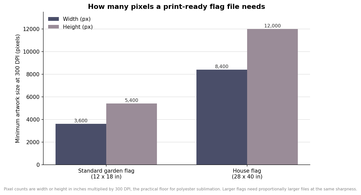
Most custom garden flags are printed by dye sublimation onto polyester, where the ink turns to gas and bonds into the fibers. That process rewards clean, high-resolution files and punishes web graphics. The working floor is 300 DPI at actual print size; a 12 by 18 inch flag therefore needs an image on the order of 3,600 by 5,400 pixels, and a house flag several times that. Vector files, supplied as AI, PDF, or EPS with fonts converted to outlines, are ideal because they scale without softening. If you must supply a raster file, a PNG at 300 DPI or better is acceptable, but a phone screenshot or a web-optimized JPEG never is. Convert the artwork to CMYK before you export, since bright RGB screen colors cannot be reproduced exactly by the dyes and will otherwise shift on delivery. The chart below shows just how large a genuinely print-ready file has to be.
Make it legible from the curb
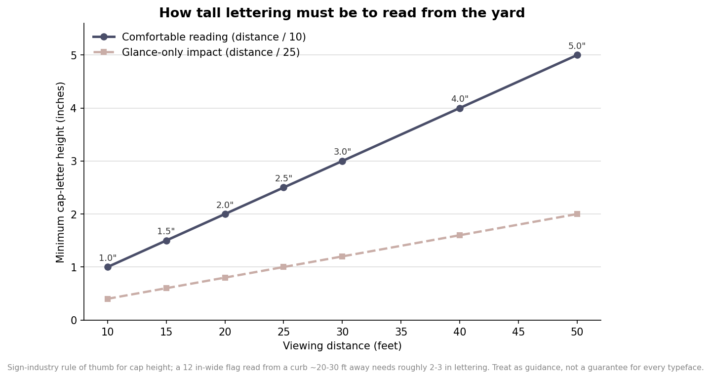
Legibility is where good-looking flags quietly fail. A garden flag is usually read from ten to thirty feet away by someone walking or driving past, and the sign trade has a durable rule of thumb for that: allow roughly one inch of capital-letter height for every ten feet of comfortable reading distance. A flag meant to be read from twenty to thirty feet therefore wants lettering in the two- to three-inch range, which on a twelve-inch-wide panel means only a few short words will ever fit. Contrast does the rest of the work, so pair a dark element against a light ground or the reverse, avoid thin script fonts that dissolve at distance, and resist cramming a paragraph onto a surface that can carry a name and maybe a short line beneath it. It also helps to test the design at its real scale before ordering: print the artwork at roughly twelve by eighteen inches, tape it up at knee height, and walk to the sidewalk. If you cannot read it from there, neither will the neighbors, and it is far cheaper to fix in the file than in a bulk run. The curve below translates viewing distance into minimum letter height.
Before you send the file, run a short final check against the flag as it will hang. Confirm the canvas is the true finished size with bleed added, that nothing critical sits in the outer safe margin or up in the sleeve, that the resolution clears 300 DPI at full size, and that the file is in CMYK. If the flag is double-sided, remember that readable back-side lettering comes from the build and print method rather than from mirroring the file yourself, so leave that to the production setup and keep your artwork oriented normally. Nail those points and the flag that arrives will match the one you designed, and it will still read clearly from the far side of the lawn. Where a figure here is called indicative, confirm it against your printer’s own template for the exact flag and stand you are ordering.